



Hero: Hero module

Hero: Default layout
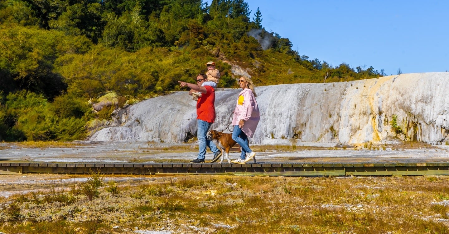
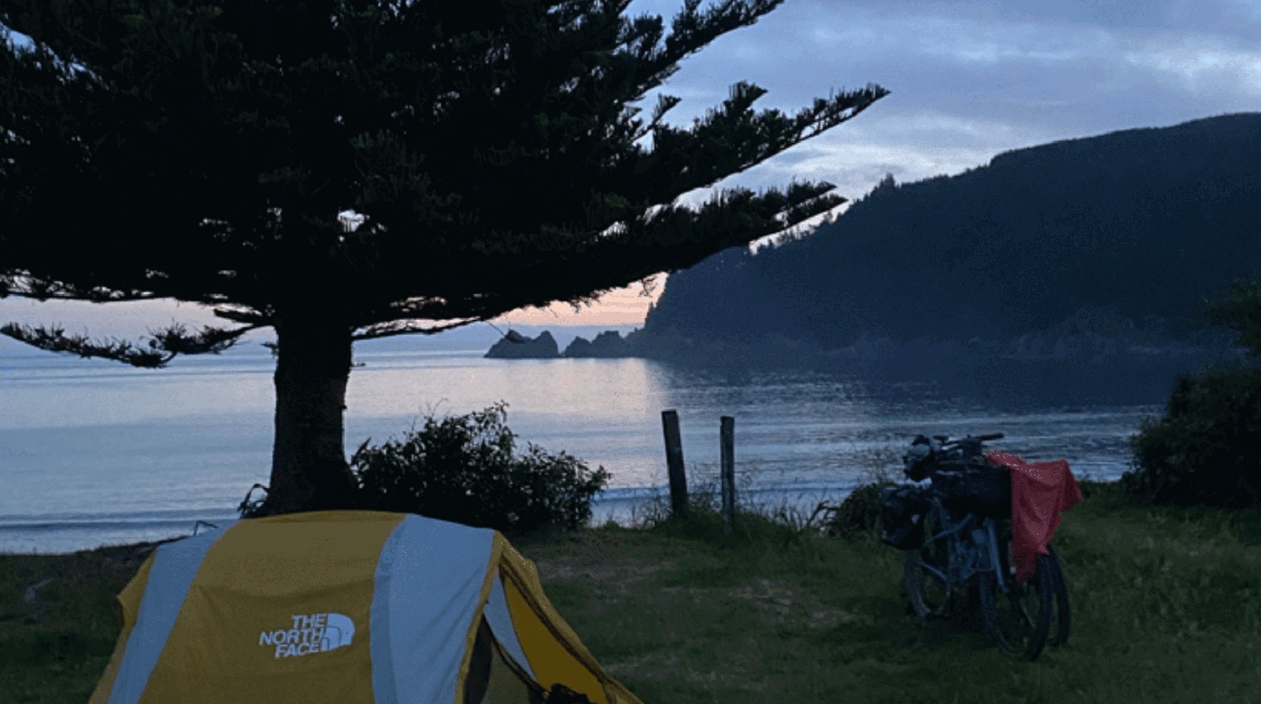
Details and buttons sit bottom-left over the fixed brand-gradient + pattern backdrop — 128px top / 64px bottom padding, 400px minimum height. Two Action-style buttons below.
Taupō Town
Hero: Feature layout
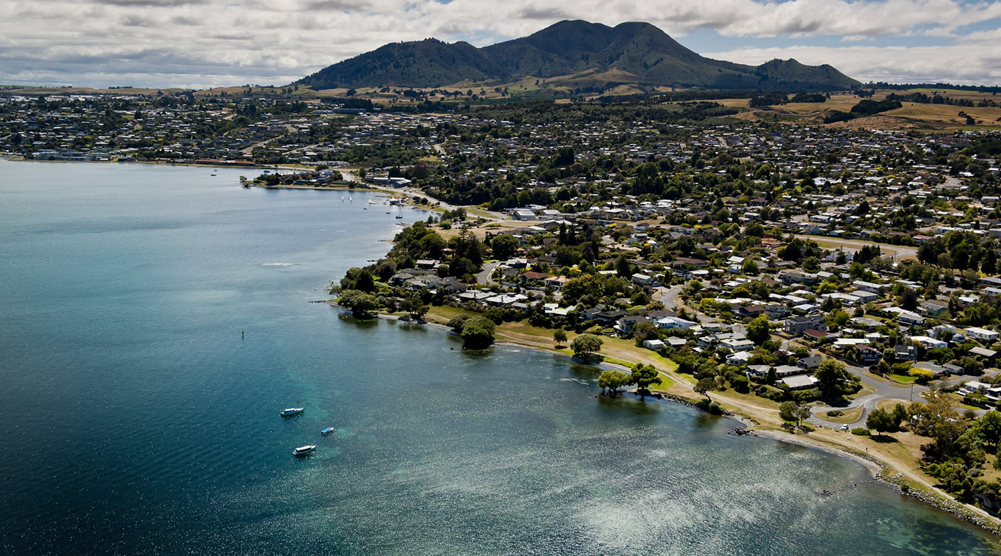
Details and buttons are centred over editor media — 230px top/bottom padding, 400px minimum height.
Taupō Town
Hero: Image background
Feature background image with srcset (300/800/1600 rungs) at sizes 100vw.
Hero: Video upload
Autoplaying muted mp4. The image is the loading tile and stays as the fallback when autoplay is blocked (e.g. Firefox for Android).
Hero: Video URL
Autoplaying muted Youtube background via the parent Plyr pipeline.

Hero: With logo
The Logo image renders above the Title; blank hides it.
Hero: Location tooltip
TMS location tag rendered with the shared location tooltip (hover/focus the pin).
Taupō Town
Hero: Overlay 50%
The Overlay slider draws a solid black fill over all background elements — set to 50% here.
Hero: Viewport height
Display height: Viewport height — the hero fills the visitor’s screen height (100svh). Idle here for 6s for the bouncing scroll hint at the hero’s foot (scrolling after it appears hides it).
Hero: Inverse for light background
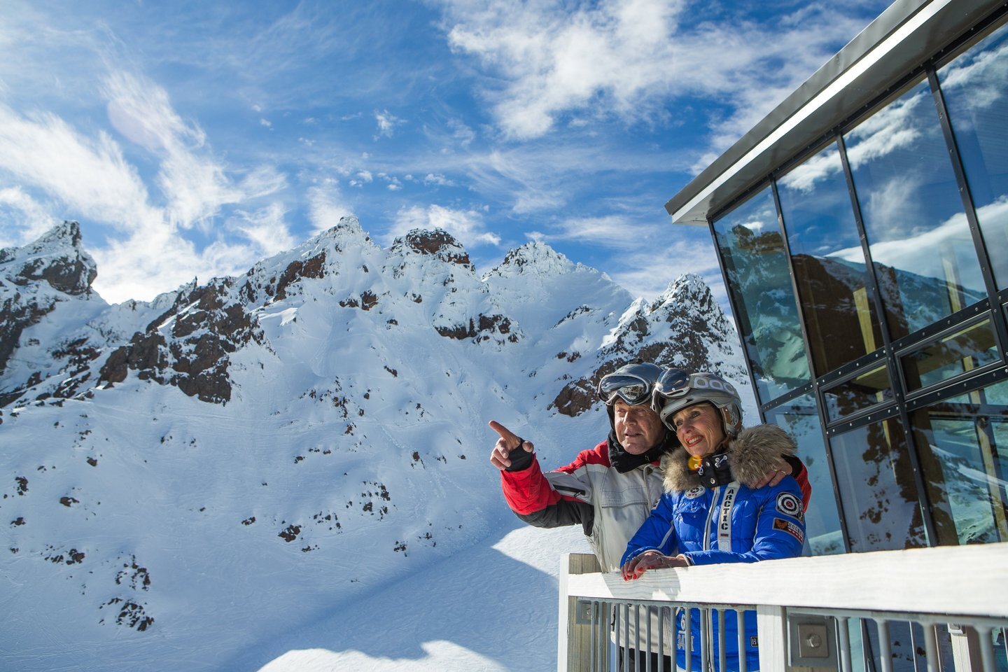
Brand-dark ink on Title, Description and the border button; the solid button keeps its own fill colours. The 60% overlay renders WHITE here.
Hero: No chin bar
Display breadcrumbs and Display share button are both off — no chin bar renders beneath the hero.