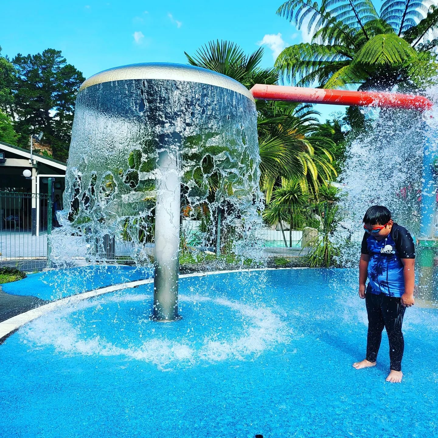
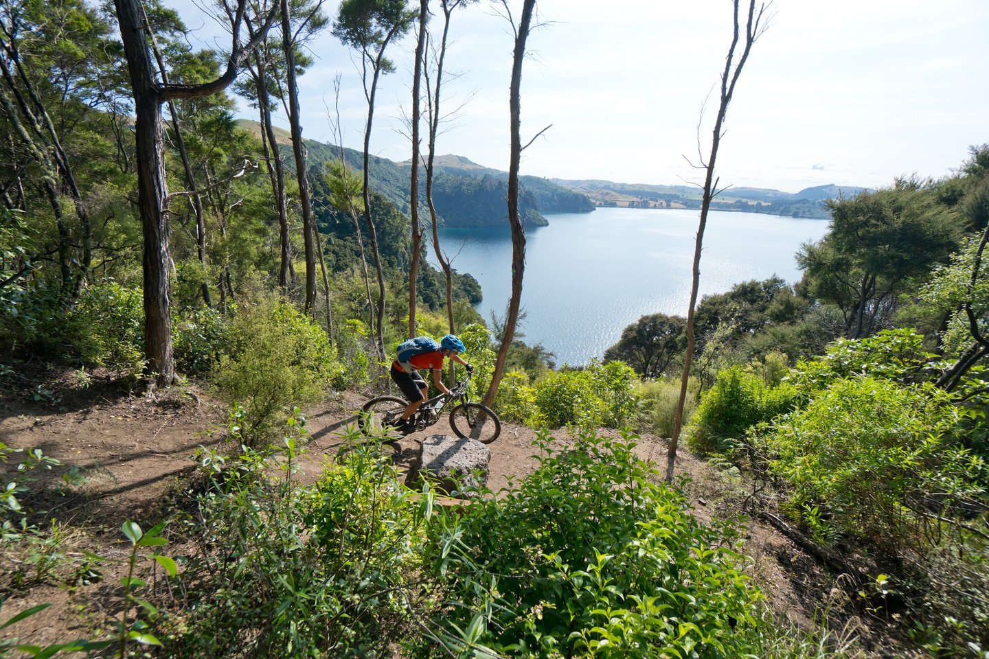
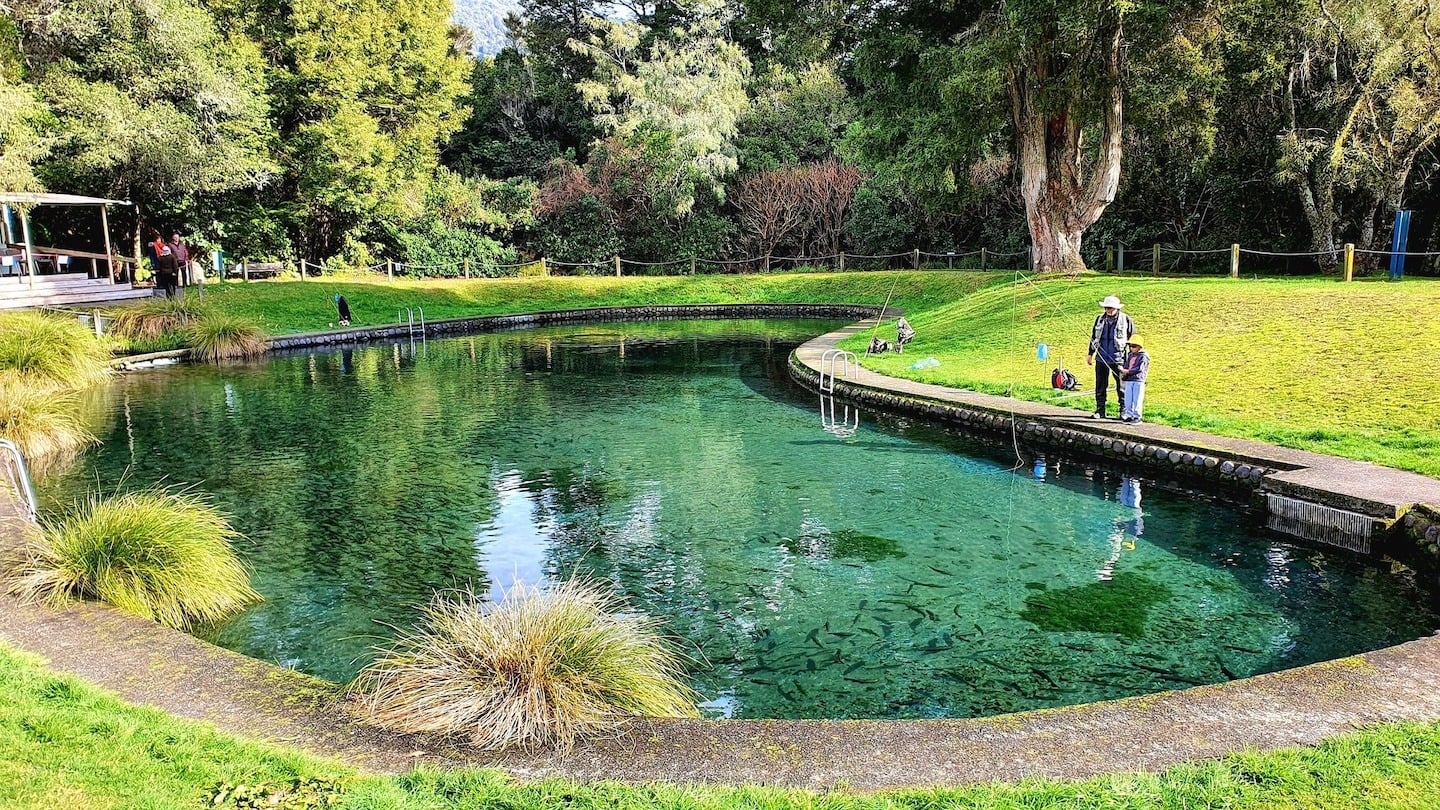
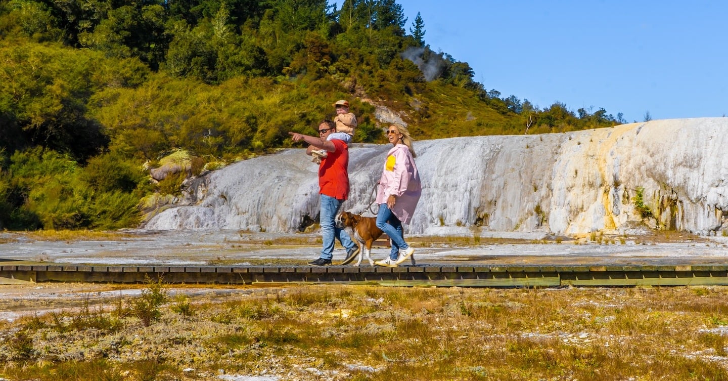
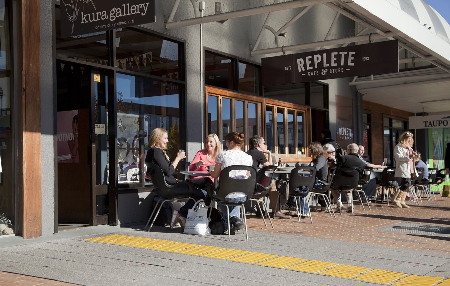
Taupō town — fixture hero image

Hero: Viewport height

Display height: Viewport height — the hero fills the visitor’s screen height (100svh). Idle here for 6s for the bouncing scroll hint at the hero’s foot (scrolling after it appears hides it).

Share this page

Copy the link below, or share it directly to your favourite platform.

Info alert:

Info banner — dismiss remembers the key in localStorage.

Success alert:

Success banner.

Warning alert:

Warning banner with an action.

Error alert:

Error banner.

Pattern library

A · Dev toolbar

The toolbar is fixed to the bottom of the viewport: brand switch, animation freeze, state stampers for the REAL modules on this page, and a section index. The chevron on the right collapses it to a flat status bar showing the settings in effect (remembered per browser). Review at 1440 and 375. The page’s own header, search modal, media viewer and the placed modules are the live instances; specimens marked staged are frozen copies with their viewport anchoring neutralised. The mobile drawer specimen follows the real <1240px media query, so it is faithful only at ≤1239px.

Freeze pauses every running animation (shimmers, spinners, bounce). Transitions cannot be paused — use the play/replay buttons. prefers-reduced-motion cannot be faked from CSS: emulate it in DevTools → Rendering. The global reset is reduced-motion-global (_scss/tools/_a11y.scss, invoked once at _scss/elements/_accessibility.scss:67).

Dev toolbar
    Brand
    Motion
    States (stamped on the real modules)

    B · Brand palette

    Every swatch paints from the LIVE custom property, so switching Brand in the toolbar re-paints this section — the hex readouts are resolved by module.js from computed styles. Components consume the abstract --color-brand-* slot tokens (declared for Visit us in _scss/_root.scss, re-bound per brand in _scss/brands/*.scss); the common-library colours below are fixed and are only for slot assignment or genuinely universal colours (see docs/guides/ui-style-guide.md “Multi-brand theming”).

    Brand contract · eight palette slots + gradient live

    :root, [data-brand='travellers'] · [data-brand='volcanic-trek-with-us'] · [data-brand='engage-with-us'] → --color-brand-primary · -primary-accent · -dark-neutral · -white-neutral · -secondary · -secondary-accent · -highlight · -special · -gradient

    _scss/_root.scss (brand contract, Visit us defaults) · _scss/brands/_volcanic-trek-with-us.scss · _scss/brands/_engage-with-us.scss — none — tokens swap with body[data-brand]; every consumer must read var(--color-brand-…), never a literal library colour JS: pattern-library module.js resolves computed values for the hex readouts

    primary--color-brand-primary
    primary-accent--color-brand-primary-accent
    dark-neutral--color-brand-dark-neutral
    white-neutral--color-brand-white-neutral
    secondary--color-brand-secondary
    secondary-accent--color-brand-secondary-accent
    highlight--color-brand-highlight
    special--color-brand-special
    gradient--color-brand-gradient

    Derived contract tokens live

    --color-brand-primary-hover · -dark-neutral-hover · -secondary-tint (color.scale +40% lightness, baked per brand) · -surface-subtle / -hover · -accent (legacy alias) · --color-focus-ring-inner / -outer

    _scss/_root.scss (brand contract, Visit us defaults) · _scss/brands/_volcanic-trek-with-us.scss · _scss/brands/_engage-with-us.scss — none — tokens swap with body[data-brand]; every consumer must read var(--color-brand-…), never a literal library colour JS: pattern-library module.js resolves computed values for the hex readouts

    primary-hover--color-brand-primary-hover
    dark-neutral-hover--color-brand-dark-neutral-hover
    secondary-tint--color-brand-secondary-tint
    surface-subtle--color-brand-surface-subtle
    surface-subtle-hover--color-brand-surface-subtle-hover
    accent (legacy alias → dark-neutral)--color-brand-accent
    focus-ring-inner--color-focus-ring-inner
    focus-ring-outer--color-focus-ring-outer

    Surface / ink pairings (on-* tokens) live

    --color-brand-on-primary · -on-secondary · -on-highlight · -on-special — consumed by _alert.scss (info/warning/error/success) and every primary-coloured surface

    _scss/_root.scss (brand contract, Visit us defaults) · _scss/brands/_volcanic-trek-with-us.scss · _scss/brands/_engage-with-us.scss — none — tokens swap with body[data-brand]; every consumer must read var(--color-brand-…), never a literal library colour JS: pattern-library module.js resolves computed values for the hex readouts

    Aaprimary / on-primary on
    Aasecondary / on-secondary on
    Aasecondary-tint / on-secondary (info alert) on
    Aahighlight / on-highlight (warning alert) on
    Aaspecial / on-special (error alert) on
    Aasurface-subtle / primary (label CTAs) on

    Contrast is decided per brand by the pairing, not by a fixed ink. Known exception: on-special (white) on Visit us / Engage Kokowai Red is ~4.0:1, below WCAG 1.4.3’s 4.5:1 (design direction 2026-09-02) — review before release promotion.

    Common colour library (fixed, brand-independent) live

    _scss/tools/_colors.scss → :root --color-primary-* · --color-secondary-* · --color-highlight-* · --color-special-* · --color-black / --color-white

    _scss/tools/_colors.scss → _scss/_root.scss :root — none — fixed values; legacy --color-special-supervolcanics-* names retained for module.css back-compat

    primary-moana-blue--color-primary-moana-blue
    primary-moana-blue-hover--color-primary-moana-blue-hover
    primary-obsidian-black--color-primary-obsidian-black
    primary-obsidian-black-hover--color-primary-obsidian-black-hover
    primary-awa-green--color-primary-awa-green
    primary-awa-dark-green--color-primary-awa-dark-green
    secondary-kikorangi-blue--color-secondary-kikorangi-blue
    secondary-kaimanawa-sunset--color-secondary-kaimanawa-sunset
    highlight-sulpher-yellow--color-highlight-sulpher-yellow
    special-kokowai-red--color-special-kokowai-red
    special-supervolcanics-red--color-special-supervolcanics-red
    special-supervolcanics-duck-egg-blue--color-special-supervolcanics-duck-egg-blue
    special-supervolcanics-forest-green--color-special-supervolcanics-forest-green
    special-supervolcanics-yellow-ochre--color-special-supervolcanics-yellow-ochre
    special-supervolcanics-white--color-special-supervolcanics-white
    black--color-black
    white--color-white

    The --color-special-supervolcanics-* names are the legacy machine values kept for 163 hand-authored module.css consumers (see the seam comment in _scss/tools/_colors.scss); new code must not read them directly — bind them to a brand slot instead.

    C · Native elements (unclassed typography + common elements)

    Bare HTML with NO theme classes, so what you see is the element-level cascade alone: the parent POWER theme reset + theme settings, then _scss/elements/ (_typography.scss body/heading/p/a/strong/summary, _forms.scss, _media.scss; _tables.scss is an empty placeholder) and the a11y focus ring. The wrapper only restores the body colour and weight that the pattern-library chrome overrides on its own root; nothing else is applied. Rich-text author copy is NOT this — that goes through the $prose-a wrappers, see section M prose.

    Headings + running text live

    h1 · h2 · h3 · h4 · h5 · h6 · p · p + p · a · strong · em · small · mark · abbr · code · kbd · sub · sup · del · ins · blockquote · pre · hr · address

    _scss/elements/_typography.scss — a: colour / opacity at base (`body a`) · body reads the --body-text-* theme settings; strong = 500 site-wide

    Heading level one

    Heading level two

    Heading level three

    Heading level four

    Heading level five
    Heading level six

    Running text at the body scale. Lake Taupō sits in the caldera of one of the world’s largest supervolcanoes, and the town wraps the lake’s northern shore. This paragraph carries a plain anchor, strong emphasis, italic emphasis, small print, marked text, an TNZ abbreviation, inline code, a Ctrl key, H2O, x2, deleted and inserted text.

    A second paragraph, to show the p + p spacing rule. It is long enough to wrap onto a second line at 1440 so the line-height and measure read as they would in body copy on a live page.

    A blockquote with a paragraph inside it, the way the rich-text editor emits one.

    <pre> block
      with preserved   spacing

    Address element: 30 Tongariro Street, Taupō 3330

    Lists + description list live

    ul · ol · li (nested) · dl · dt · dd

    _scss/elements/_typography.scss (bare ol counters + dl rhythm) over the parent POWER theme reset — none

    • Unordered item one
    • Unordered item two, with a nested list
      • Nested item
      • Nested item
    • Unordered item three
    1. Ordered item one
    2. Ordered item two
      1. Nested ordered item
      2. Nested ordered item
    3. Ordered item three
    Term
    Definition of the term.
    Another term
    Its definition, long enough to wrap so the indent is visible on a second line.

    Table live

    table · caption · thead · tbody · tfoot · th · td

    _scss/elements/_tables.scss (th weight 500 · start-aligned) → parent POWER theme + browser defaults — none

    Table caption
    Column AColumn BColumn C
    Row oneCellCell
    Row twoCell with longer content that may wrapCell
    FooterFooterFooter

    Figure, image, details live

    figure · img · figcaption · details · summary

    _scss/elements/_media.scss (video only) · _typography.scss summary (marker removed; svg chevron-rotate at base — no svg in a bare summary) — summary svg chevron-rotate (not exercised here)

    Craters of the Moon walk placeholder
    Figure caption under a bare image.
    Bare details/summary (no disclosure classes)

    Disclosed content. Compare with the styled disclosures in section L.

    Form controls live

    form · label · input[text|email|number|date|search|checkbox|radio] · select · textarea · button · input[submit|reset] · fieldset · legend

    _scss/elements/_forms.scss (appearance:none on select + form .hs-form-field controls) · _accessibility.scss focus-visible ring — focus ring only

    Fieldset legend

    D · Form controls (theme library)

    The theme has no form classes of its own — every form on the site is a HubSpot form embed, so the styled contract IS HubSpot’s renderer markup (form.hs-form · fieldset.form-columns-N · .hs-form-field > label + .input > .hs-input · ul.inputs-list · ul.hs-error-msgs · .hs_submit.hs-submit > .actions > .hs-button) as skinned by the parent POWER theme’s form section (pwr-defer.css, driven by the Theme Settings → Forms tokens --clr-form-*, --ff/--fs/--fw-form-*), plus the child’s _scss/elements/_forms.scss (native appearance reset) and _scss/components/_parent-buttons.scss (.hs-submit on the brand-primary slot). The markup below is hand-copied from HubSpot’s v2 form renderer; there is no live form module on this page, so pattern-library.scss stands in for the base stylesheet the embed injects (fieldset reset + form-columns float grid + inputs-list reset) — the parent skin assumes it and nothing in that stand-in restyles a control. The footer’s bespoke subscribe skin is in section M. Compare the unclassed controls in section C.

    HubSpot form · default wrapper (light) live

    div:not(.pwr-form) > .hs_cos_wrapper_type_form > form.hs-form · .hs-form-required · .hs-input (text · email · select · date · textarea) · .field.error + .hs-input.invalid + ul.hs-error-msgs · .hs-form-checkbox-display · .hs-form-radio-display · .hs-form-booleancheckbox-display · .legal-consent-container .hs-richtext · .hs-submit .hs-button.primary.large

    parent pwr-defer.css “Forms” section (Theme Settings → Forms tokens) · _scss/elements/_forms.scss · _scss/components/_parent-buttons.scss (.hs-submit) · parent pwr-form.js (none here) — .hs-submit: the button swap at base (child) · parent input focus border swap JS: HubSpot form embed (v2 renderer markup hand-copied here; no live form module on this page)

    HubSpot form · .pwr-form.pwr--dark wrapper live

    .pwr-form.pwr--dark > form.hs-form — parent re-binds label / input / error ink to the --clr-form-*-dk tokens; the child .hs-submit skin is unchanged

    parent pwr-defer.css “Forms” section (Theme Settings → Forms tokens) · _scss/elements/_forms.scss · _scss/components/_parent-buttons.scss (.hs-submit) · parent pwr-form.js (none here) — .hs-submit: the button swap at base (child) · parent input focus border swap JS: HubSpot form embed (v2 renderer markup hand-copied here; no live form module on this page)

    E · Motion tokens + focus ring

    Motion tokens · live readouts + gauges live

    :root --motion-factor · --motion-duration-fast / -base / -slow / -slower / -notch · --motion-loop-shimmer / -spin · --motion-ease-standard / -emphasised / -linear · --motion-rise · --motion-zoom-scale · --skeleton-opacity · --pending-opacity · --color-skeleton-base / -sheen · --color-media-base · --color-hover-wash-dark / -light

    _scss/_root.scss → _scss/tools/_motion.scss — --motion-duration-fast 150ms · -base 200ms · -slow 300ms · -slower 500ms · -notch (= slower) — each × --motion-factor (the parent Theme Settings speed control, --ts-duration-factor; un-pinned 2026-09-11) · --motion-loop-shimmer 1200ms / -spin 900ms (unscaled) · --motion-ease-standard ease · -emphasised cubic-bezier(0.25, 1, 0.5, 1) · -linear · --motion-rise 8px · --motion-zoom-scale 1.05 JS: window.ltMotion (_js/motion.js): durationMs / loopMs / dwellMs / reduced / afterTransition — every script timing reads the same tokens

    Every value below is read from the LIVE custom property (module.js), so a Theme Settings → Animation change (or a brand switch) re-reads here. The resolved column is what window.ltMotion.durationMs() returns to scripts — CSS and JS run on the same clock.

    • --motion-factor
    • --motion-duration-fast
    • --motion-duration-base
    • --motion-duration-slow
    • --motion-duration-slower
    • --motion-duration-notch
    • --motion-loop-shimmer
    • --motion-loop-spin
    • --motion-ease-standard
    • --motion-ease-emphasised
    • --motion-ease-linear
    • --motion-rise
    • --motion-zoom-scale
    • --skeleton-opacity
    • --pending-opacity
    • --color-skeleton-base
    • --color-skeleton-sheen
    • --color-media-base
    • --color-hover-wash-dark
    • --color-hover-wash-light
    --motion-duration-fast × --motion-ease-standard — focus ring · card border · dots · tooltip label
    --motion-duration-base × --motion-ease-standard — button swap · row tint · pending dim · underline wipe · overlay EXIT
    --motion-duration-slow × --motion-ease-emphasised — overlay / drawer / disclosure ENTER · header chrome
    --motion-duration-slower × --motion-ease-emphasised — media zoom · video reveal · header wash
    --motion-duration-notch × --motion-ease-standard — inline-link notch travel

    Each gauge fills its track over the live token with the live easing — Play one, or Play all side by side; the fill stays full until the next play. Stylelint refuses a literal duration / easing or transition: all anywhere under _scss/ except the token files, and a lone :focus outside the a11y fallback.

    Focus ring (focus-ring-grow) live

    .focus-ring-strong → :focus-visible · @keyframes focus-ring-grow

    _scss/tools/_a11y.scss · keyframe emitted once in elements/_accessibility.scss — @keyframes focus-ring-grow (outline-offset 0 → 2px) · fast · standard · reduced-motion: none JS: focus-ring-strong mixin; outline !important beats the parent’s outline:none rules. Components never redefine ring geometry.

    Focusable link

    Eight keyframes exist in the theme's own CSS: focus-ring-grow (tools/_a11y) · pwr-x-hero-hint-bounce, pwr-x-hero-hint-fade (_hero) · pwr-x-media-viewer-in, pwr-x-media-viewer-spin (_media-viewer) · spotlight-shimmer (_spotlight) · search-spin, search-thumb-shimmer (_search-modal).

    Three skeleton implementations, no shared mixin: editor-only flat _skeleton.scss · live card/video shimmer in _spotlight.scss · thumbnail shimmer in _search-modal.scss (and the media viewer's spinner is a fourth loading treatment). No local reduced-motion guard in _spotlight, _navigation, _slider, _header — they rely on the global reset alone.

    F · Buttons, links, pills, tooltip

    .btn family live

    .btn .btn-primary .btn-primary-dark .btn-primary-light .btn-primary-moana .btn-primary-obsidian .btn-primary-red .btn-primary-green .btn-secondary .btn-secondary-green .btn-secondary-moana .btn-secondary-obsidian .btn-secondary-red .btn-tertiary .btn-outline .btn-outline-light .btn-white .btn-grey .btn-transparent

    _scss/elements/_buttons.scss — BUTTON class: background-color / border-color / color / opacity at base · standard (`button-swap`) — never `all` · hover = flat colour swap (brand -hover step, or a 12 % film via color-mix / the --color-hover-wash-* tokens) · :hover + :focus-visible paired · .is-loading / [aria-busy] = --pending-opacity + wait cursor

    .pwr-cta variants (parent, restyled) live

    .pwr-cta--primary-solid --regular-solid --regular-solid-primary-background --primary-border --regular-border --primary-label --link --link--back --hubspot-style · sizes --small --large --long

    _scss/components/_parent-buttons.scss — same button swap at base (`body`-prefixed so it beats the parent’s later-loaded 0.4s ease-in-out recipe — confirmed live 2026-09-11) · Link CTA = LABEL-LINK class: background-size underline wipe + colour at base; the parent chevron nudge is retimed to base too · the parent’s slide-up fill stays DISABLED

    Pills, chips, badges live

    .pwr-x-pillbox(--squared) · .basic-spotlight__card-taxon-chip · .spotlight__card-pill--operator/--listing/--deal/--event · .spotlight__card-badge · .lt-interest-filter__pill [aria-pressed]

    _scss/components/_spotlight.scss — pills: the .btn button swap at base · edge fades: mask-image is not interpolable, so the flags swap instantly (no transition pretends otherwise) JS: js/scripts.js filter controller; interest-filter.js aria-pressed pills

    pillbox pillbox squared taxon chip Operator Listing Deal Event Badge
    button swap (ring fill + ink) at base · global focus ring

    Location tooltip live

    .pwr-x-tooltip · __icon · __label · __bubble · .is-expanded (room for the label) · .spotlight__card-tooltip skin

    _scss/components/_pwr-x-tooltip.scss — label fades in at fast when .is-expanded lands (was a pop) JS: js/scripts.js measurePwrxTooltip — ResizeObserver decides label vs icon

    Tongariro National Park
    Tongariro National Park

    Wide row → .is-expanded (label inline). 48px row → icon only; hover/focus the icon for the bubble. Measured by js/scripts.js at load and on resize.

    Pattern library · navigation

    G · Header + navigation

    Desktop mega panel · open (pillar 1) · six pillar colours staged

    .header-nav--primary > .navigation-primary > ul.mainmenu > li.has-children.megablock-open[data-pillar-colour] > .megablock

    _scss/components/_navigation.scss — OVERLAY class: panel opacity at slow · emphasised · header wash (background-color / box-shadow / ::before opacity) at slower so the panel lands first · pure-CSS :hover / :focus-within fallback JS: navigation.js adds li.megablock-open + aria-expanded (hover-intent safe triangle, ≥1240px + pointer:fine)

    ≥1240px: the first pillar opens on load; hovering another pillar moves the stamped .megablock-open to it (mirrors the real hover-intent — the stamped panel used to stay open underneath). The obsidian band stands in for the header-over-hero state — the desktop pillar ink is white until #header.scrolled. Pillar colours: awa-green · kaimanawa-sunset · kikorangi-blue · moana-blue · obsidian-black · supervolcanics-red via --pillar-fill / --pillar-on-fill. navigation.js binds the FIRST .navigation-primary (the real header), so keyboard/hover-intent are not wired here.

    Mobile drawer · open · tier-2 panel active staged

    .header-nav--primary.active.has-active-panel · .megablock.active · .megablock--tools (Back / Close) · .mainmenu--tools

    _scss/components/_navigation.scss — OVERLAY class (`overlay-motion` / `overlay-hidden`): open opacity + translateX at slow · emphasised; closed at base · standard + visibility 0s delayed on close ONLY (instant on open so focus() is never a WebKit no-op — the sanctioned pattern) · tier-2 panel identical · reduced-motion: none JS: navigation.js: .active / .has-active-panel / .megablock.active; binds the FIRST .header-nav--primary only

    Rendered inside a 375px-wide iframe pinned to the top of the frame band (it used to fall below the band — a stage-class collision fixed 2026-09-11) that copies the page’s stylesheets, so the real ≤1239px drawer media query applies at any page width (brand and freeze are mirrored into the frame). Same markup as the real drawer: the shared renderMenu macro over a two-tier tree, .active + .has-active-panel, tier-2 panel held .active by the stamped class. Toggle replays the slow·emphasised slide in / base slide out + the asymmetric visibility delay. Compare against the real drawer: resize to ≤1239px and tap the burger.

    Real header states live

    #header.scrolled · #header.search-open · .header-logo a · button[data-toggle-search]

    _scss/components/_header.scss — gradient on #header::before (opacity) + background-color + box-shadow at slow — one interpolable crossfade both ways (the old gradient→#fff swap snapped) · logo / icon colour at slow · search toggle circle: --color-hover-wash-light / -dark at base JS: js/scripts.js adds #header.scrolled on scroll; .search-open while search is open

    The header transitions are keyed on #header, so there is no static copy — use the toolbar stampers “Header: scrolled” and “Header: search-open” and watch the page header. Real mega menu: hover a pillar. Real drawer: ≤1239px burger.

    Pattern library · overlays

    H · Overlays

    Search modal · idle staged

    #searchPopup.custom-popup.custom-popup--search.custom-popup--active · .search-popup--input-spinner · .search-popup--results · .search-popup--no-results · .search-popup--pagination

    _scss/components/_popup.scss — .custom-popup opacity at slow · visibility 0s delayed on close · --active drops the delay · reduced-motion: none JS: js/scripts.js search controller: .custom-popup--active + #header.search-open + body.no-overflow

    Search modal · loading staged

    #searchPopup.custom-popup.custom-popup--search.custom-popup--active · .search-popup--input-spinner · .search-popup--results · .search-popup--no-results · .search-popup--pagination

    _scss/components/_search-modal.scss → tools `spinner-ring` — the ONE spinner: @keyframes lt-spin at --motion-loop-spin (900ms) linear · --spinner-size 26px · reduced-motion: static ring JS: js/scripts.js holds it ≥ base (200ms) and announces “Searching…” after slow (300ms) — both via window.ltMotion

    Search modal · results staged

    #searchPopup.custom-popup.custom-popup--search.custom-popup--active · .search-popup--input-spinner · .search-popup--results · .search-popup--no-results · .search-popup--pagination

    _scss/components/_search-modal.scss → tools `skeleton-surface` — the ONE skeleton on a light re-bind of the tokens (#e8e8e8 base / #f6f6f6 sheen) · lt-skeleton-shimmer at --motion-loop-shimmer · STOPS on .is-loaded (image load/error) — it used to run forever JS: js/scripts.js stamps .is-loaded on the frame

    Search modal · no-results staged

    #searchPopup.custom-popup.custom-popup--search.custom-popup--active · .search-popup--input-spinner · .search-popup--results · .search-popup--no-results · .search-popup--pagination

    _scss/components/_popup.scss — .custom-popup opacity at slow · visibility 0s delayed on close · --active drops the delay · reduced-motion: none JS: js/scripts.js search controller: .custom-popup--active + #header.search-open + body.no-overflow

    Search modal · pagination staged

    #searchPopup.custom-popup.custom-popup--search.custom-popup--active · .search-popup--input-spinner · .search-popup--results · .search-popup--no-results · .search-popup--pagination

    _scss/components/_search-modal.scss — #searchInput.is-pointer-focus animation: none !important (suppresses focus-ring-grow for mouse users) · chrome buttons: button swap at base, --color-hover-wash-light

    Live instance: the header search icon ([data-toggle-search]) opens the real #searchPopup — deliberately NOT modal (no aria-modal, no focus trap, no backdrop close) so the mega nav stays usable above it.

    Filters tray · open · data-tray-mode="filters" staged

    .custom-popup.custom-popup--tray.custom-popup--active > .custom-popup--close + .custom-popup--inner > __header / __body / __footer

    _scss/components/_popup.scss — OVERLAY class: .custom-popup--inner translateY(100 % → 0) at slow · emphasised · scrim opacity at slow · reduced-motion: none JS: js/scripts.js createModalTray (closure-private): --active, body scroll lock, Tab trap, focus return

    Dates tray · data-tray-mode="dates" staged

    .custom-popup--tray[data-tray-mode="dates"] · .spotlight__dates-panel · __dates-actions

    _scss/components/_offerings-spotlight.scss — .spotlight__when + Clear buttons: LABEL-LINK wipe at base · popover: `rise-in` on reveal (fade + --motion-rise at slow · emphasised); the close is the [hidden] cut JS: js/scripts.js [data-spotlight-when-toggle]; the ONE dates panel re-hosts between tray and popover

    Desktop dates popover (disclosure) staged

    .spotlight__when-wrap > .spotlight__when + .spotlight__when-popover[data-spotlight-when-popover]

    _scss/components/_offerings-spotlight.scss — .spotlight__when + Clear buttons: LABEL-LINK wipe at base · popover: `rise-in` on reveal (fade + --motion-rise at slow · emphasised); the close is the [hidden] cut JS: js/scripts.js [data-spotlight-when-toggle]; the ONE dates panel re-hosts between tray and popover

    Live instance: the real Offerings Spotlight on this page (When button ≥lg; Filters / When trays below lg).

    Media viewer · loading staged

    #lt-media-viewer.pwr-x-media-viewer.is-loading · __stage::after spinner

    _scss/components/_media-viewer.scss → tools `spinner-ring` — the ONE spinner at --spinner-size 40px on the stage · lt-spin 900ms linear · reduced-motion: static JS: removed on load / loadeddata / error

    Media viewer · loaded (image + caption + location tag) staged

    .pwr-x-media-viewer · __toolbar · __stage · __tags · __caption · @keyframes pwr-x-media-viewer-in

    _scss/components/_media-viewer.scss — OVERLAY class: @keyframes pwr-x-media-viewer-in (fade + rise) at slow · emphasised · EXIT symmetric: .is-closing fades + drops at base, then hidden (afterTransition, timeout fallback) · loaded media fades in at base JS: _js/components/media-viewer.js: inert siblings, Tab trap, focus return, lt:media-viewer:open

    Media viewer · live trigger + in-place fullscreen live

    a[data-lt-viewer="image"] (trigger_attrs) → real #lt-media-viewer · [data-lt-media-frame] + .pwr-x-media-viewer__fullscreen → .is-fullscreen / .is-fullscreen-overlay

    _scss/components/_media-viewer.scss — button swap at base on the fullscreen / close buttons JS: requestFullscreen → .is-fullscreen; iOS fallback → .is-fullscreen-overlay + html.pwr-x-media-viewer-overlay-open

    Share dialog live

    dialog.pwr-x-share[data-lt-share-dialog] · __inner · __close · __copy · __feedback[aria-live] · __platforms

    _scss/components/_share-dialog.scss — OVERLAY class on a native

    : @starting-style + transition-behavior: allow-discrete — fade + rise in at slow · emphasised, fade + drop out at base; ::backdrop fades with it; engines without it cut (the old behaviour) · buttons: button swap at base · reduced-motion: none JS: _js/components/share-dialog.js: focus to Close, return to trigger, backdrop click closes

    Share this page

    Copy the link below, or share it directly to your favourite platform.

    Share dialog · staged (open inline) staged

    dialog.pwr-x-share[open] — no ::backdrop without showModal() · toggle [open] to replay the @starting-style entrance / allow-discrete exit

    _scss/components/_share-dialog.scss — OVERLAY class on a native

    : @starting-style + transition-behavior: allow-discrete — fade + rise in at slow · emphasised, fade + drop out at base; ::backdrop fades with it; engines without it cut (the old behaviour) · buttons: button swap at base · reduced-motion: none JS: _js/components/share-dialog.js: focus to Close, return to trigger, backdrop click closes

    Share this page

    Copy the link below, or share it directly to your favourite platform.

    Choose your interest

    Find adventures that match your vibe! Whether you're with the whānau, your furry mate, or flying solo, we've got plenty to inspire your Taupō getaway.

    Your interest

    Choose a region

    Pattern library: Basic spotlight · slider · load-more · filters

    Pattern library: Basic spotlight · slider · load-more · filters — Spotlight modules can be displayed as slider.

    • Couple walking at Huka Falls, Taupō

      Walks · Family-friendly

      Huka Falls riverside walk
      Taupō Region
    • Couple walking at Craters of the Moon, Taupō

      Adventure · 2 hours

      Craters of the Moon thermal trail
      Taupō Town
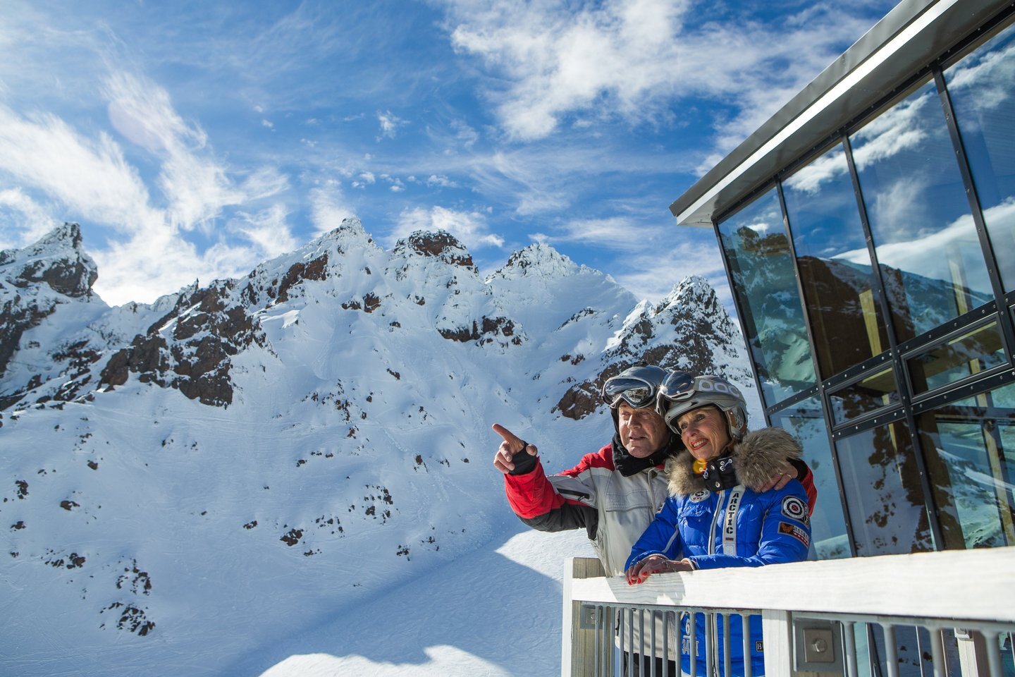
    • Snow sport couple smiling, Ruapehu

      Cafés · Locally owned

      Whakapapa ski fields, Ruapehu
      Tūrangi
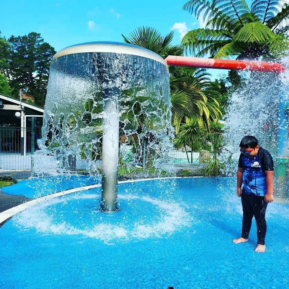
    • Child playing in the water at DeBretts hot pools, Taupō

      Lake views · Sunset

      DeBretts hot pools (opens in new tab)
      Kinloch
    • Boat trip with dog near Huka Falls, Taupō

      Cycling · Easy

      Huka Falls jet boat tour
      Tongariro National Park
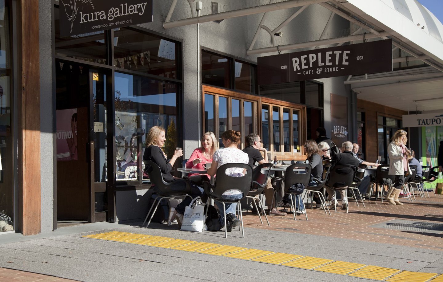
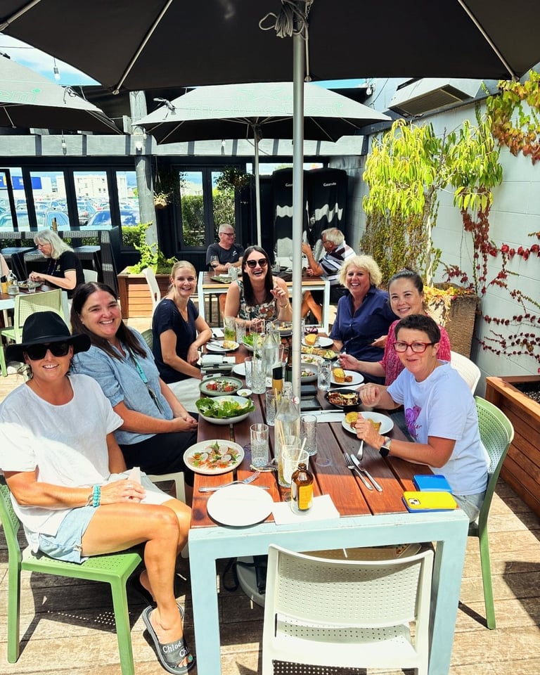
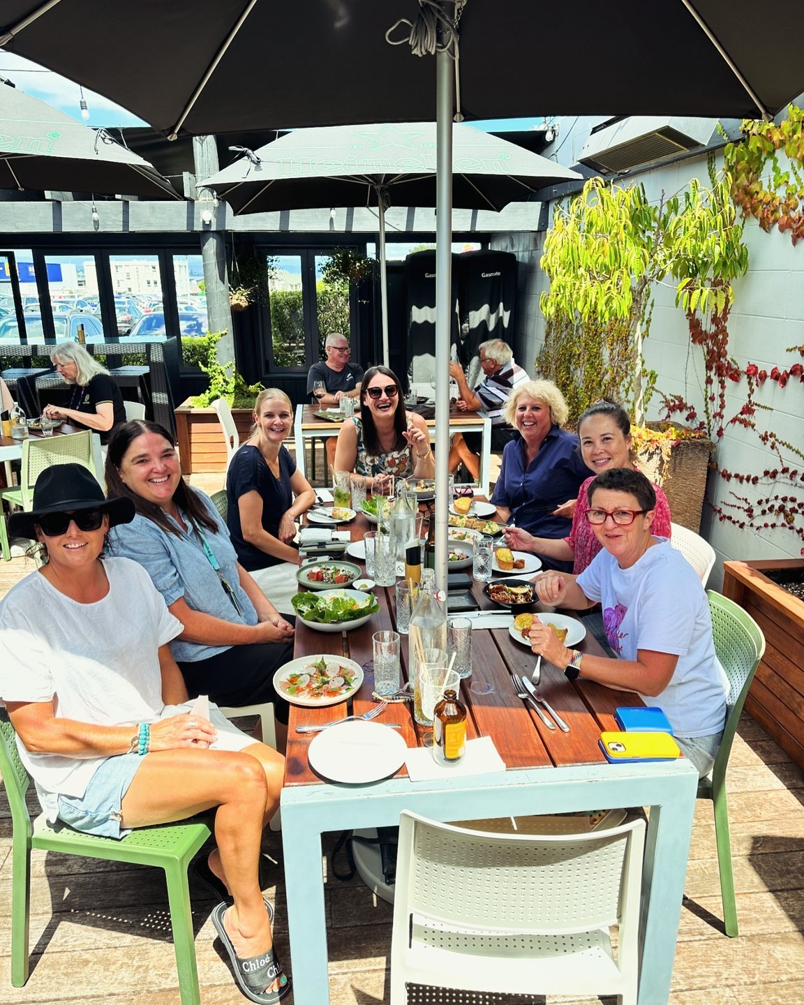
    • Friends at Replete Café, Taupō town

      Thermal · Year-round

      Replete Café, Taupō town
      Lake Taupō

    Pattern library: Dark scheme · Basic spotlight · rows

    Pattern library: Dark scheme · Basic spotlight · rows — Spotlight modules can be displayed as rows, size default, masonry default.

    Pattern library: Offerings spotlight · filters tray · dates

    Displaying 6 of 20

    Pattern library · spotlight + skeletons

    I · Spotlight states

    Truthful path: the toolbar stampers push these classes onto the REAL spotlights placed on this page. The rows below are hand-copied minimal cards (basic-spotlight.module/module.html renderCard, 2026-09-10) for side-by-side comparison — the wrapper deliberately has NO .spotlight class, or js/scripts.js would claim it.

    Card states · light staged

    .spotlight__card · --linked (hover) · .is-skeleton (shimmer) · --has-video + .spotlight__card-video.is-video-loading · --empty (renderEmptyCard)

    _scss/components/_spotlight.scss → tools `skeleton-surface` — .spotlight__card.is-skeleton / .spotlight--order-pending .spotlight__card: --color-skeleton-base at --skeleton-opacity (0.2; .spotlight--dark re-binds 0.4) + lt-skeleton-shimmer sweep at --motion-loop-shimmer · reduced-motion: static frame JS: js/scripts.js: load-more dwell = --motion-duration-slower, 0 under reduced motion; swapped-in cards `lt-rise-in` (≤ 40ms stagger, cap 8); shuffle lifts --order-pending after ranking

    Card states · dark scheme staged

    .spotlight--dark …

    _scss/components/_spotlight.scss → tools `skeleton-surface` — .spotlight__card-video.is-video-loading::after: the same surface, opacity to --skeleton-opacity at slow, then the sweep · reduced-motion: static JS: js/scripts.js spotlightWireVideoLoading — until a poster/first frame paints (safety timeout)

    Card hover live

    .spotlight__card--linked:hover / :focus-within → zoom-on-hover(.spotlight__card-media img, .spotlight__card-video) · card ::after border-width at fast

    _scss/components/_spotlight.scss → tools `zoomable` / `zoom-on-hover` — MEDIA ZOOM: scale(--motion-zoom-scale 1.05) at slower · emphasised · :hover + :focus-within · (hover: hover) only · reduced-motion: none · card ::after focus border at fast

    Hover or focus the linked card above: scale(--motion-zoom-scale) at slower · emphasised, guarded by (hover: hover) and a local reduced-motion reset — the same mixin every card, slider and legacy zoom now uses.

    Load more · pending + exiting staged

    button.spotlight__load-more.pwr-cta_button.pwr-cta--primary-label · .is-loading · .spotlight__batch.is-exiting

    _scss/components/_spotlight.scss — .spotlight__load-more.is-loading = pending state (--pending-opacity, eased both ways) · .spotlight__more.is-exiting: fade + rise-out at base (max-height at slow), removed via afterTransition (timeout fallback) JS: js/scripts.js [data-spotlight-load-more]; Smart re-query: results region .is-loading keeps its outgoing min-height, pressed pills go aria-busy, fresh cards rise in, a failure shows an .lt-alert--error row

    A .spotlight__more.is-exiting — fades + rises out at base, removed via ltMotion.afterTransition (transitionend + timeout fallback).

    Slider tools · paginator + prev/next staged

    .spotlight__tools > .spotlight__pagination > .spotlight__pagination-dot.is-active · .sliders--tool-buttons

    _scss/components/_spotlight.scss — .spotlight__pagination-dot background-color at fast · .is-active JS: js/scripts.js paginable controller (display-only dots, aria-hidden)

    Filter bar · scroller + pills staged

    .spotlight__filters > .spotlight__filters-scroll--prev/--next + ul.spotlight__filters-list > li.spotlight__filters-item > button[aria-pressed] · edge fades (mask-image, instant)

    _scss/components/_spotlight.scss — pills: the .btn button swap at base · edge fades: mask-image is not interpolable, so the flags swap instantly (no transition pretends otherwise) JS: js/scripts.js filter controller; interest-filter.js aria-pressed pills

    Legacy .sliders--* hover zoom live

    .sliders--item / --deals-item / --events-item :hover, :focus-within → zoom-on-hover · .sliders--tag-nav-prev opacity at base

    _scss/components/_slider.scss → tools `zoomable` / `zoom-on-hover` — MEDIA ZOOM (same mixin as the cards) · tag nav opacity at base · legacy module.css copies (cards, sliders, inspirational-articles, sub-menu, category-cta, webcam-weather) now read the --motion-* tokens too

    Hover: image zoom

    J · Loading primitives + editor skeleton compositions

    ONE loading vocabulary (_scss/components/_skeleton.scss + the tools mixins): the skeleton surface (base / sheen / opacity tokens, a shimmer that always stops), the spinner ring, the pending state and the rise-in entrance. The card skeletons in I, the search thumbnail in H, the viewer spinner in H, the TOC rail in L, the footer form and prose iframes in M and the map in K are all these primitives — no component declares its own colours or timings.

    Loading primitives staged

    .lt-skeleton-surface(.is-loaded / --static) · .lt-spinner[--spinner-size] · .lt-rise-in[--rise-index] · .lt-pending.is-loading · .lt-obf:empty[--obf-width] · .lt-skeleton__bar / __block / __tag / __button

    _scss/components/_skeleton.scss (primitives) · _scss/tools/_motion.scss (mixins) — .lt-skeleton-surface (::before shimmer until .is-loaded, --static = flat) · .lt-spinner (--spinner-size) · .lt-rise-in (fade + --motion-rise at slow · emphasised, --rise-index × 40ms) · .lt-pending / .is-loading (--pending-opacity at base both ways) · .lt-obf:empty (static bar sized by --obf-width) JS: _js/components/skeleton-until-load.js stamps .is-loaded on the child media’s load / loadeddata / error (8s safety)

    .lt-skeleton-surface — shimmering until .is-loaded
    --static (editor frames)
    .is-loaded (sweep faded out)
    .lt-spinner 26px (search input) · 40px (viewer stage) — lt-spin at --motion-loop-spin, static under reduced motion
    plan-trip map overlay (light re-bind via --spinner-track / --spinner-ink)
    • rise-in · index 0
    • rise-in · index 1
    • rise-in · index 2
    • rise-in · index 3
    .lt-pending — toggle .is-loading (dims to --pending-opacity, eased both ways)

    Obfuscated contact text before JS fills it: (a static bar sized by --obf-width) · after: +64 7 376 0000

    .lt-skeleton__bar / __tag / __button / __block (static, the editor-composition primitives)

    skeleton hero(label, with_summary) staged

    .lt-skeleton.lt-skeleton--hero · __notice (.lt-alert--info) · __hero-panel · __title-row · __actions · __hero-figure

    _scss/components/_skeleton.scss — the same skeleton surface, static (`skeleton-surface(true)`): --color-skeleton-base at --skeleton-opacity, no sweep (editor-only, is_in_editor-gated by callers); info alert notice, no dismiss JS: templates/partials/skeleton-macros.html; metrics from _scss/tools/_detail.scss

    skeleton details(label, "listing") staged

    .lt-skeleton--details · __main · __section · __pair · __capacities · __rail · __map · __address

    _scss/components/_skeleton.scss — the same skeleton surface, static (`skeleton-surface(true)`): --color-skeleton-base at --skeleton-opacity, no sweep (editor-only, is_in_editor-gated by callers); info alert notice, no dismiss JS: templates/partials/skeleton-macros.html; metrics from _scss/tools/_detail.scss

    skeleton details(label, "operator") staged

    .lt-skeleton--details · __main · __section · __pair · __capacities · __rail · __map · __address

    _scss/components/_skeleton.scss — the same skeleton surface, static (`skeleton-surface(true)`): --color-skeleton-base at --skeleton-opacity, no sweep (editor-only, is_in_editor-gated by callers); info alert notice, no dismiss JS: templates/partials/skeleton-macros.html; metrics from _scss/tools/_detail.scss

    skeleton details(label, "event") staged

    .lt-skeleton--details · __main · __section · __pair · __capacities · __rail · __map · __address

    _scss/components/_skeleton.scss — the same skeleton surface, static (`skeleton-surface(true)`): --color-skeleton-base at --skeleton-opacity, no sweep (editor-only, is_in_editor-gated by callers); info alert notice, no dismiss JS: templates/partials/skeleton-macros.html; metrics from _scss/tools/_detail.scss

    skeleton media_spotlight(label) staged

    .lt-skeleton--media · __slider · __media-card · __slider-tools · __dots · __nav

    _scss/components/_skeleton.scss — the same skeleton surface, static (`skeleton-surface(true)`): --color-skeleton-base at --skeleton-opacity, no sweep (editor-only, is_in_editor-gated by callers); info alert notice, no dismiss JS: templates/partials/skeleton-macros.html; metrics from _scss/tools/_detail.scss

    skeleton offerings_spotlight(label) staged

    .lt-skeleton--offerings · __offer-grid · __offer-card · __offer-media · __offer-body · __offer-foot

    _scss/components/_skeleton.scss — the same skeleton surface, static (`skeleton-surface(true)`): --color-skeleton-base at --skeleton-opacity, no sweep (editor-only, is_in_editor-gated by callers); info alert notice, no dismiss JS: templates/partials/skeleton-macros.html; metrics from _scss/tools/_detail.scss

    Uncover the magic of Taupō

    Lorem ipsum description under the title — hidden entirely when left blank. This baseline exercises every text surface at once.

    Custom alt text set on the image field
    Caption beneath the media — also blank-hides.
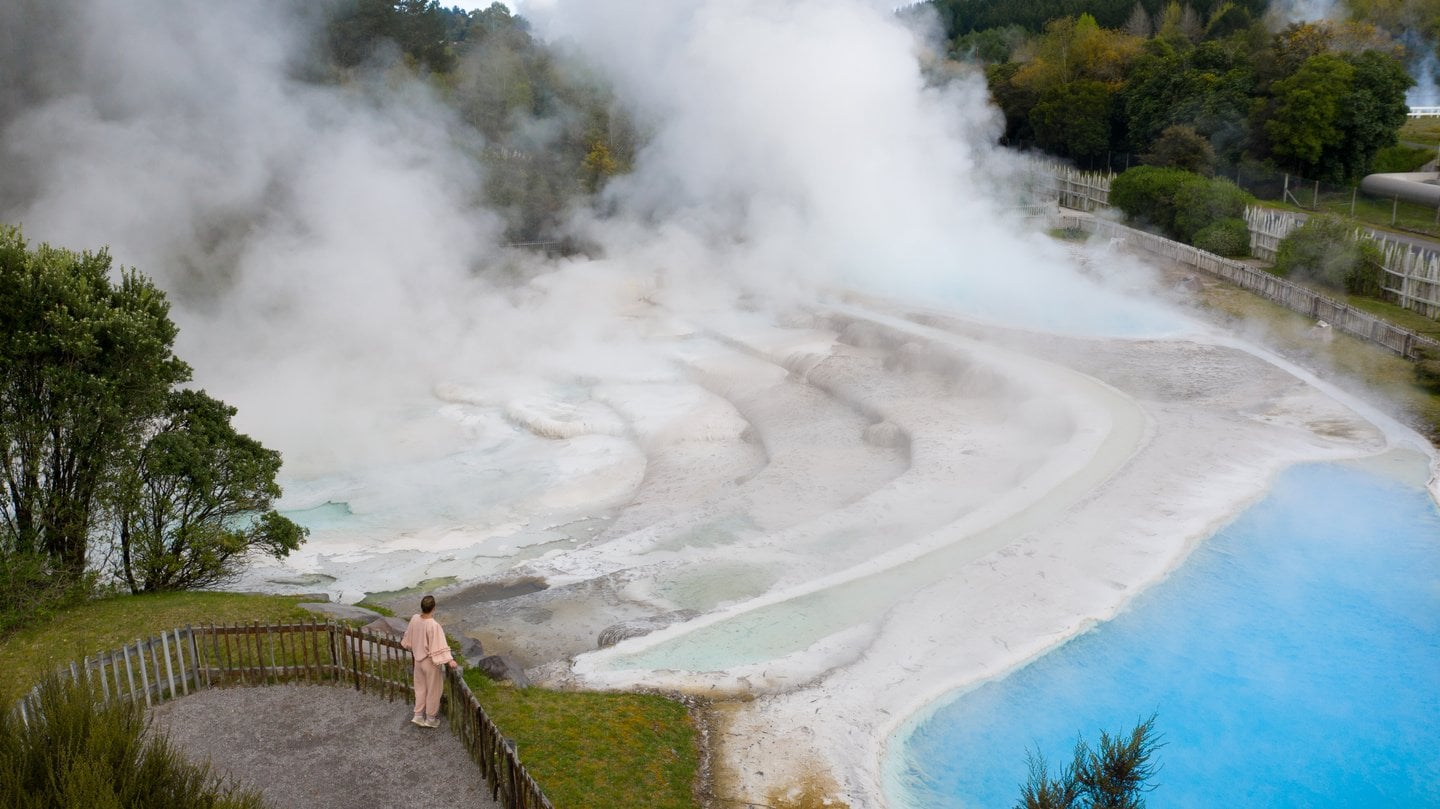
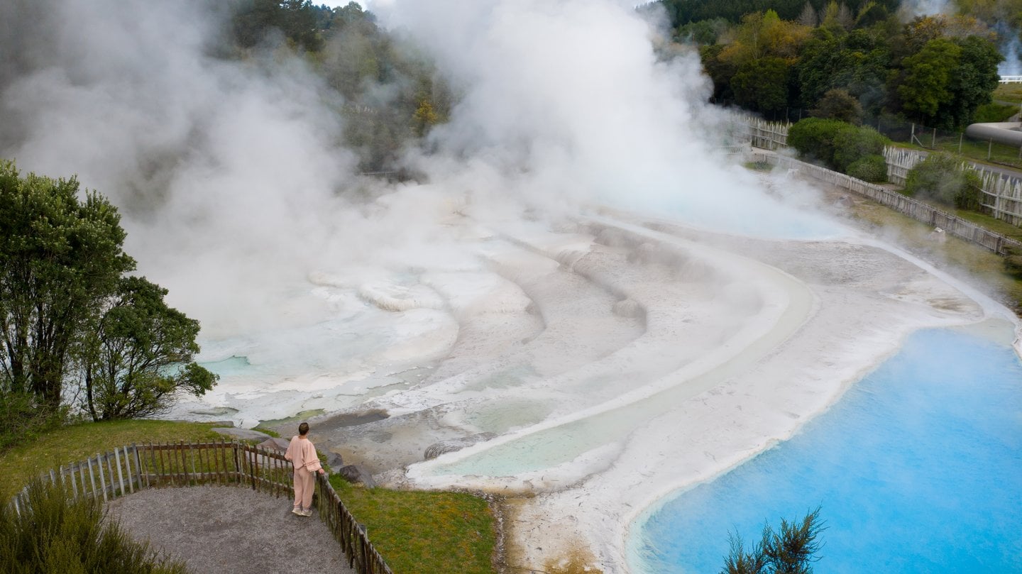
    Thermal walk at Wairakei Terraces, Taupō
    mp4 · no autoplay — native controls, image as poster.

    Share this page

    Copy the link below, or share it directly to your favourite platform.

    Small Heading

    Discover Taupō region

    Taupō features breathtaking landscapes and thrilling activities. Visitors can explore quaint resort towns, relax in lakeside villages, and enjoy luxurious lodges. With adventures like water sports and hiking, Taupō guarantees an unforgettable experience of discovery and excitement.

    Info alert:

    Alert module — dismissable, remembered per key.

    Pattern library: Action · horizontal solid primary

    Pattern library: Action · horizontal solid primary — this longer description gives the renderer enough copy to wrap onto multiple lines, exercising the module's text-flow, scheme contrast, and intro-width spacing rules in a realistic way.

    Pattern library · detail, disclosures, misc

    K · Detail-page family

    Action bar (action-bar-macros) live

    .lt-action-bar > __action (--primary) · __icon

    mailto:/tel: hrefs and the address text are obfuscated at render and revealed by contact-obfuscation.js (data-lt-obf-*) — before JS runs the link is a dead href="#".

    Qualmark badge (qualmark-macros) live

    qualmark_logo(rating, segment, grade) → asset URL · .lt-detail-hero__qualmark
    Qualmark gold five star Qualmark silver three star plus Qualmark bronze Qualmark Visitor Information

    Sidebar terms disclosure live

    details.lt-detail-sidebar__terms > summary.lt-detail-sidebar__terms-summary::after (chevron-rotate, base) · [open]

    _scss/components/_detail-sidebar.scss → tools `chevron-rotate` — the ONE disclosure chevron: rotate 180° (45° → 225°) at base JS: native

    Layout capacities live

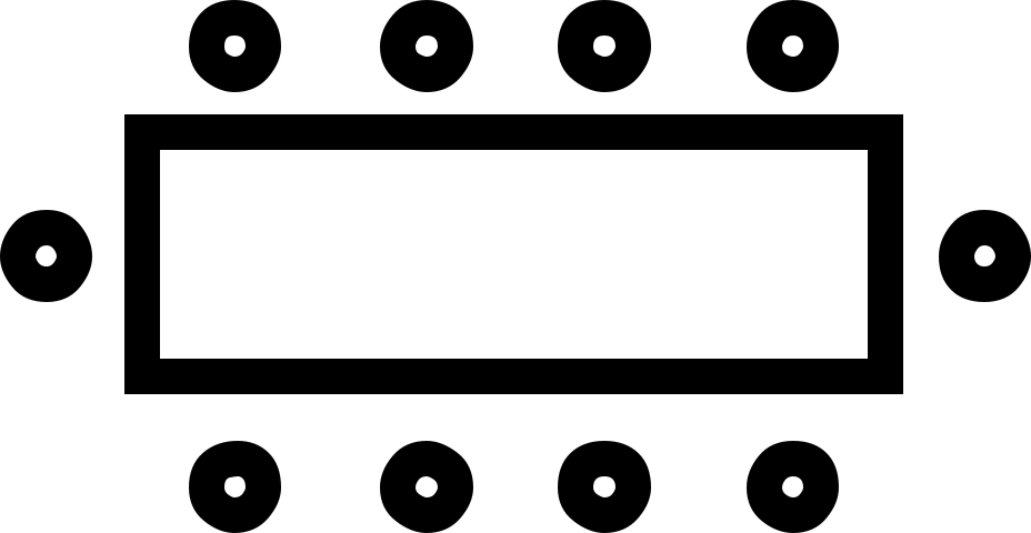
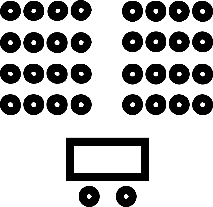
    dl.lt-layout-capacity > __card > __icon + __text > dt.__label / dd.__value

    Layout capacities

    Banquet
    120 guests
    Boardroom
    18 guests
    Theatre
    200 guests
    Cocktail
    150 guests

    Sidebar map · skeleton until load staged

    .lt-detail-sidebar__map.lt-skeleton-surface > iframe (detail-body-macros map_sidebar) · .is-loaded stamped by skeleton-until-load.js

    _scss/components/_skeleton.scss (primitives) · _scss/tools/_motion.scss (mixins) — .lt-skeleton-surface (::before shimmer until .is-loaded, --static = flat) · .lt-spinner (--spinner-size) · .lt-rise-in (fade + --motion-rise at slow · emphasised, --rise-index × 40ms) · .lt-pending / .is-loading (--pending-opacity at base both ways) · .lt-obf:empty (static bar sized by --obf-width) JS: _js/components/skeleton-until-load.js stamps .is-loaded on the child media’s load / loadeddata / error (8s safety)

    Detail hero / body placeholders staged

    .lt-detail-hero--placeholder · .lt-detail-body--placeholder · .asset-empty (--editor)

    _scss/components/_detail-hero.scss — .lt-detail-hero__figure paints --color-media-base under the eager image (no shimmer — a first-paint reservation, not a loading state)

    Placeholder hero

    --color-media-base paints under the eager image (a first-paint reservation, not a loading state).

    This record is not available

    .asset-empty — the soft-404 state of a dynamic detail page without a row.

    L · Disclosures

    Intro text · read more live

    .intro-text__summary[aria-expanded] (--active, chevron-rotate) · .intro-text__details[hidden] max-height at slow

    _scss/components/_intro-text.scss — DISCLOSURE: max-height at slow · chevron-rotate at base · reduced-motion: none JS: intro-text.module/module.js settles via ltMotion.afterTransition (transitionend + timeout) — fixes the reduced-motion bug where the closed panel stayed in the tab order

    Small heading

    Discover Taupō region

    Summary paragraph. Press Read more to expand the details with the max-height transition and the rotating chevron.

    Live only when the real Intro Text module is on the page (its module.js wires every .intro-text__summary at DOMContentLoaded).

    Guidelines accordion · open + closed staged

    .guideline-accordion > h3.accordion-heading > button.accordion-title(.active) > svg.plus / svg.minus · .accordion-content

    modules/guidelines.module/module.js — height slide at --motion-duration-slow (was a literal 400ms) · plus/minus glyph swap · instant under reduced motion JS: single-open accordion

    Expanded content. The real module slides height at --motion-duration-slow (vanilla JS).

    Live instance: the real Guidelines module on this page.

    Native details / summary live

    details > summary svg (chevron-rotate, base) · ::details-content height at slow under @supports (interpolate-size: allow-keywords)

    _scss/elements/_typography.scss — summary svg chevron-rotate at base · ::details-content height at slow under @supports (interpolate-size: allow-keywords) JS: native

    Native disclosure

    Content revealed by the browser; height animates only where interpolate-size is supported.

    Story table of contents live

    .lt-story__layout > nav.lt-story-toc.is-pending[data-lt-story-toc] (reserved rail + __skeleton bars) → .is-ready + .lt-story__body[data-lt-story-body] · __list (rise-in) · __link[aria-current]

    _scss/components/_story-contents.scss — rail RESERVED from first paint (.is-pending: min-height + three static skeleton bars) → .is-ready swaps in the list with rise-in (stagger) · link colour + badge at base JS: _js/components/story-toc.js: built client-side from body headings; IntersectionObserver keeps aria-current

    Getting there

    Story body copy. The list on the left is built from these headings by story-toc.js; scroll and watch aria-current move.

    By road

    State Highway 1 runs the length of the lake.

    By air

    Taupō airport is ten minutes from town.

    Where to stay

    Lakefront hotels, holiday parks and lodges.

    What to pack

    Layers — the plateau is cooler than the lake edge.

    M · Alerts, breadcrumbs, back-to-top, prose, forms, video, Swiper, AOS

    Alerts · four types staged

    .lt-alert.lt-alert--info|--success|--warning|--error > __message + __actions + button.lt-alert__close

    _scss/components/_alert.scss — dismiss = .is-dismissing: fade + height / padding collapse at base (interpolate-size), then hidden via afterTransition; body padding-top eases with the banner offset JS: alert-dismiss.js

    Info alert: Info alert message with an inline link.
    Success alert: Success alert message with an inline link.
    Warning alert: Warning alert message with an inline link.
    Error alert: Error alert message with an inline link.

    Live instances: the alert banner in the page header and the Alert module on this page (alert-dismiss.js). Dismiss = .is-dismissing (fade + height collapse at base) then hidden — the page no longer jumps by the row height in one frame.

    Breadcrumb bar · four variants live

    .lt-breadcrumbs(.variant-1..4) > .container > __columns > ol.__list > li[aria-current] · __share

    _scss/components/_breadcrumbs.scss — trace shell ships .lt-breadcrumbs--reserved (row height held, invisible) → --revealed rises in at slow · emphasised · share button colour at base JS: breadcrumb-trace.js fills the shell once consent resolves

    Back to top (parent) staged

    a.pwr-adv-back-to-top.visible · --shadow · --visible-on-all-devices · data-visible-after

    src/local/maka_Agency/POWER THEME/css/pwr.css (parent) — .pwr-adv-back-to-top opacity/visibility → .visible after data-visible-after px (parent pwr.js) — parent motion, scaled by the same --ts-duration-factor JS: inherited via base_pwr.footer(); no child code

    The real button is emitted by base_pwr.footer() and appears after scrolling data-visible-after px (parent pwr.js).

    Prose + inline gallery + embed live

    .pwr-x-prose · figure > img[width][height] + figcaption (reserved on --color-media-base) · .lt-gallery.lt-gallery--cols-3 · .hs-embed-wrapper > iframe (skeleton until load) · blockquote

    _scss/components/_prose.scss — links: the inline-link notch · figures reserve their box (width/height attrs → height:auto; 3:2 fallback) on --color-media-base · provider iframes: skeleton behind the 16:9 box until load JS: skeleton-until-load.js

    Prose heading

    Body copy with a link that carries the underline notch, strong text and emphasis.

    Couple walking at Huka Falls, Taupō
    Captioned figure (width/height attributes reserve the box).

    Photo: Love Taupō

    A pull quote on the brand quote surface.

    Footer subscribe form skin + embed reservation live

    .footer-panel--form .hs_cos_wrapper_type_form (min-height + two static skeleton bars until :has(form)) · .hs-form > .hs-form-field.hs_email (floating label via :has) + .hs_submit.hs-submit > .hs-button · .hs-error-msgs

    _scss/components/_footer.scss — embed wrapper reserves min-height + two static skeleton bars until :has(form) (CSS-only), bars fade at base · .hs-button: button swap at base, hover → brand primary · floating label via :has(.hs-input:focus) JS: HubSpot form embed

    Video poster facade + Plyr reveal staged

    .lt-video-poster (painted beneath) · .pwr-video-background-plyr .plyr opacity 0 → .player--visible · Media module: .pwr-x-media__img fades out at slower on --playing

    _scss/components/_video-facade.scss + _media.scss + parent pwr.css — poster → player: ONE video-reveal timing (slower): .pwr-x-media__img fades out at slower, the hero file video fades in at slower, the parent Plyr fade stays on its own --ts-bg-video-fade-duration JS: parent pwr.js; templates/partials/video-macros.html

    Plyr player (stub) — opacity 0 until .player--visible

    Live instance: the Media module video and the hero video on this page (parent pwr.js adds player--visible on playing).

    Swiper pagination bullets staged

    .swiper-pagination > .swiper-pagination-bullet(-active) — child.css overrides (7px, 50px radius, active obsidian)

    child.css + _scss/vendor/_swiper.scss — Swiper slide transitions (vendor) · bullets restyled 7px / 50px radius, active obsidian JS: js/scripts.js Swiper init

    AOS scroll animation (parent) · DISABLED live

    fields.json animation.aos.is_aos = false → base_pwr.html emits no data-aos-global-* and macros_aos.get_aos() renders nothing

    fields.json (child) `animation.aos.is_aos` = false · parent pwr.css / pwr.js — DISABLED site-wide (decision 2026-09-11): base_pwr.html emits no data-aos-global-* and macros_aos.get_aos() renders nothing while is_aos is off — parent-derived sections no longer reveal in patches beside pwr-x-* components. The get_aos() calls stay in place for a settings-only opt-in. JS: none while disabled

    Animation on Scroll is switched OFF site-wide (decision 2026-09-11): it only ever reached parent-derived sections, so a page mixing them with Love Taupō components revealed in patches. Entrance motion is reserved for async-inserted content (the rise-in primitive in J). The setting lives in this theme’s fields.json (Theme Settings → Animation → Animation on Scroll) as a settings-only opt-in.

    Hero motion (real module) live

    .pwr-x-hero--video-playing (fade at slower) · [data-lt-hero-scroll-hint] fade in at slow, .is-leaving out at base, bounce loop · [data-lt-hero-media-toggle][aria-pressed] · .is-paused

    _scss/components/_hero.scss — file video fades in at slower (.pwr-x-hero--video-playing) · scroll hint: OVERLAY class — fade in at slow · emphasised, .is-leaving fades out at base then hidden (afterTransition) · bounce loop 3500ms (own cycle) · reduced-motion: none JS: hero.module/module.js: 6s idle hint, play/pause toggle aria-pressed

    Live instance: the hero at the top of this page — idle 6s for the scroll hint; the pause toggle stamps .is-paused.

    N · Not covered

    • Legacy module.css motion now reads the --motion-* tokens (durations, easings, zoom scale; transition: all expanded to named properties; vendor-prefixed duplicates dropped; plan-trip’s spinner and entrance ride .lt-spinner / lt-rise-in) — but those rules still live in per-module module.css files with no (hover: hover) guard and no local reduced-motion reset (global reset only). They migrate into SCSS one module at a time; sec-* / bentos* are parent-derived and keep the parent’s own transitions (scaled by the same factor).
    • HubSpot cookie banner — native; the theme only listens for consent.
    • Parent pwr.js behaviours the child does not restyle — parallax, masonry, GLightbox (used by sec-video / sec-image-boxes), pwr-accordion / pwr-tabs (legacy mode only).
    • vanilla-calendar internals — the dates panel shows a stub; the real calendar initialises lazily inside the Offerings Spotlight.
    • Pricing / event date macros — need HubDB-typed rows; see the real /listings and /events pages.

    Personalise your Love Taupō experience

    Tell us what you love and we will shape what you see — the trips, stories and deals that actually suit you.